Have you ever felt frustrated when you can’t zoom in on a website on your phone? I have. As a WordPress developer and SEO expert, I’ve seen how bad mobile sites can lose customers. It’s a big problem in our mobile world.
Internet users now mostly use mobile phones, with 92.3% of them doing so. This change is huge. Businesses must adapt to this shift. Mobile optimisation is key for a good user experience, not just looks.
Improving websites for mobile users is more than just looks. It’s about being fast, functional, and easy to use. Did you know 53% of visitors leave if a site takes over three seconds to load? This shows how important mobile optimisation is for keeping visitors and turning them into customers.
In this guide, I’ll share tips and strategies for mobile optimisation. It’s vital for small business owners and marketing pros to understand these ideas. They help stay ahead in the digital world.
Key Takeaways
- 92.3% of internet users access the web via mobile phones
- 53% of visitors abandon sites that load in over 3 seconds
- Mobile optimisation is key for keeping users and converting them
- 55% of all website traffic comes from mobile devices
- Good mobile sites make for a better user experience
- Mobile-friendly sites rank higher in search results
Understanding Mobile Optimisation Fundamentals
Mobile optimisation is key in today’s digital world. I’ll look at the main ideas, how mobile-first design has grown, and the latest stats on mobile use. This shows why it’s so important.
Definition and Core Concepts
Mobile optimisation makes websites work well on mobile devices. It makes sure sites look good on all screens and work well. The main ideas include responsive design, easy-to-use navigation, and making content easy to access.
The Evolution of Mobile-First Design
Mobile-first design has changed a lot. It used to be an extra thought, but now it’s the main focus. This change is because more people use the internet on their phones. It’s key for making websites that are easy to use and work well for everyone.
Current Mobile Usage Statistics
The latest stats on mobile use show why mobile optimisation is vital:
- More than 60% of online searches happen on mobiles
- More people use the internet on mobiles than on computers
- Mobile users spend more time on their devices than desktop users
| Device Type | Global Conversion Rate (Q1 2016) |
|---|---|
| Desktop | 3.63% |
| Smartphone | 1.25% |
These figures show why businesses must focus on mobile optimisation. By using mobile-first design and improving mobile SEO, websites can be more visible, user-friendly, and successful in a world where mobiles are the norm.
The Impact of Mobile Traffic on Digital Success
The role of mobile traffic in digital success is clear. With almost 60% of Google searches on mobiles, businesses must focus on mobile optimisation. Fast website loading is key, as 53% of mobile users leave slow sites.
Consumer habits have changed a lot. Mobile shopping has grown by 48% during the pandemic. This shows how vital mobile-friendly sites are for businesses.
Mobile optimisation is more than just good user experience. Google now ranks mobile-friendly sites higher. Ignoring mobile optimisation can hurt a site’s visibility and traffic, affecting digital success.
To show why mobile optimisation matters:
- 64% of SEO marketers see it as a key investment
- 45% of global consumers shop online daily on mobiles
- Slow sites often have higher bounce rates
- Mobile optimisation makes shopping easy from social media
In today’s world, mobile optimisation is essential, not just an advantage. Focusing on mobile traffic boosts website performance and digital success.
Essential Components of Mobile Optimisation
Mobile optimisation is key in today’s digital world. I’ll look at three main parts that make websites great on small screens.
Responsive Web Design
Responsive design is the heart of mobile optimisation. It lets websites change smoothly for different screen sizes. This ensures a good experience on all devices. In the UK, where over 80% of internet users have smartphones, this is very important.
Touch-Friendly Navigation
Navigation that works well with touch is vital for mobile users. With about 50% of UK web traffic from mobiles, it’s key to make interfaces easy to use with fingers. This means bigger buttons, swipe gestures, and menus that work well with thumbs.
Content Accessibility
Ensuring all users can use your website is key. This means making text and images clear, and adding captions to videos. These steps can boost engagement, as 70% of mobile searches lead to action within an hour.
| Component | Benefit | Impact |
|---|---|---|
| Responsive Design | Adapts to all screen sizes | Improved SEO rankings |
| Touch-Friendly Navigation | Easier user interaction | Increased time on site |
| Content Accessibility | Inclusive user experience | Higher engagement rates |
By focusing on these areas, websites can greatly improve their mobile performance and user happiness.
Mobile-First Design Principles
Mobile-first design is now key in our mobile world. Over 60% of web traffic comes from mobiles. It’s vital to focus on mobile experiences. I’ll look at what makes mobile-first design good and easy to use.
Layout Considerations
For mobile layouts, keep it simple. A single-column layout works well, letting users scroll up and down. This makes content easy to read on small screens. Put the most important info at the top.
Visual Hierarchy
Creating a clear visual hierarchy is essential. Use different font sizes, colours, and white space to draw attention. Headlines should be short but strong, and body text should be easy to read even at small sizes.
Mobile users often scan content quickly. So, use subheadings and bullet points to help them find what they need.
User Interface Elements
Designing for mobile means paying close attention to UI elements. Buttons and links should be big enough to tap easily, at least 44×44 pixels. Use gestures like swipes for navigation. Forms should be simple, with few fields and clear messages.
By following these tips, we can make mobile experiences that are both useful and fun.
| Design Element | Mobile-First Consideration |
|---|---|
| Layout | Single-column, vertical scrolling |
| Typography | Large, readable fonts (16px minimum) |
| Navigation | Hamburger menu or bottom navigation bar |
| Images | Optimised for quick loading |
Performance Optimisation Strategies
As an SEO expert, I’ve learned how vital website speed is today. With over 60% of web traffic from mobiles, focusing on mobile site performance is key.
Did you know 80% of users leave an app if it doesn’t load first? And most give up if a site takes over 3 seconds to load. These facts highlight the importance of mobile site performance strategies.
To improve your mobile site, consider these strategies:
- Optimise images: Use efficient formats like JPEG for photos and PNG for graphics
- Minify code: Remove unnecessary characters from your HTML, CSS, and JavaScript
- Implement browser caching: Store static files on users’ devices to reduce load times
- Utilise lazy loading: Delay loading of non-critical images until they’re needed
Using Accelerated Mobile Pages (AMP) is also effective. It can make your mobile site much faster, improving user experience and search rankings.
“Speed is a feature. Users won’t wait for slow apps.”
It’s important to regularly check your site’s performance. Look at bounce rates and session times. High bounce rates or short session times mean your site needs more work.
By using these speed optimisation techniques, you’ll make your mobile site faster and more engaging. This will keep users coming back.
Content Strategy for Mobile Users
A solid mobile content strategy is key today. With 54.8% of global website traffic from mobiles, making content for small screens is essential. Let’s look at how to create mobile-friendly content.
Writing for Mobile Screens
When writing for mobile, keep it short. Use short paragraphs and bullet points for easy reading. I aim for 2-3 sentences per paragraph to keep readers interested.
Descriptive subheadings help users find what they need quickly.
Image Optimisation
Optimising images is vital for mobile content. Smaller, optimised images can cut loading times by up to 50%. I compress images without losing quality and use responsive design for proper display on all devices.
Video Content Delivery
Video content is big on mobile. I focus on making video playback smooth and consider data usage. Adaptive bitrate streaming helps videos play well on different networks.
| Content Type | Best Practices | Impact |
|---|---|---|
| Text | Short paragraphs, bullet points | 15-20% reduction in bounce rates |
| Images | Compression, responsive design | Up to 50% faster load times |
| Video | Adaptive bitrate streaming | Improved user engagement |
By using these mobile content strategies, businesses can see SEO improvements of up to 30%. A well-optimised mobile site can boost conversion rates by up to 160% compared to non-optimised sites.
Mobile Navigation Best Practices
In my work as a WordPress developer, I’ve learned that mobile navigation is key for a good user experience. A well-designed menu can make or break a mobile site’s success. Let’s look at some important practices for better mobile navigation and keeping users interested.
The hamburger menu is a common choice for mobile navigation. It’s a small icon that opens a full menu when tapped. But, there are other options too. Bottom navigation bars are becoming popular, mainly for apps with 3-5 main sections. These bars give quick access to main features without hiding them.
When designing mobile navigation, simplicity is best. I try to keep main menu items between 3-5. This helps avoid overwhelming users and makes it easy for them to find what they need. For more complex sites, I use nested menus or accordions. But, it’s important to keep these to no more than three levels deep to avoid confusion.
Touch-friendly design is essential for mobile navigation. Buttons and menu items should be big enough for fingers to tap easily. I aim for a minimum touch target size of 44×44 pixels.
| Navigation Element | Best Practice | User Impact |
|---|---|---|
| Hamburger Menu | Use for sites with many sections | Saves space, familiar to users |
| Bottom Navigation Bar | Limit to 3-5 main items | Quick access to core features |
| Nested Menus | Maximum 3 levels deep | Prevents user confusion |
| Touch Targets | Minimum 44×44 pixels | Reduces mis-taps, improves usability |
The main goal of mobile navigation is to guide users smoothly through your site or app. By following these best practices, you’ll make a user-friendly experience that keeps visitors coming back.
Speed Optimisation Techniques
In today’s fast digital world, how quickly a page loads is key to mobile success. A staggering 53% of users leave if a site takes more than three seconds to load. This shows how vital it is to make mobile sites load fast.
Page Load Time Improvement
To make pages load faster, we should aim to reduce Round Trip Requests (RTRs). A good page should have under 50 RTRs, but many have over 100. By merging JavaScript and CSS files, we can greatly reduce requests and speed up loading times.
Resource Compression
Compressing resources is a top way to speed up mobile sites. Gzip can cut file sizes by up to 70%, and Brotli can do even better. These methods are key for quick data transfer on mobile networks.
Caching Implementation
Good caching is essential for mobile optimisation. For sites that don’t change often, caching most elements for up to a year can make a big difference. It’s important to set proper expiration times; without them, files must be fetched every time, slowing things down.
| Optimisation Technique | Potential Impact |
|---|---|
| Gzip Compression | Up to 70% file size reduction |
| Reducing RTRs | Faster page load times, improved efficiency |
| Effective Caching | Significant improvement in load times for returning visitors |
By using these speed optimisation methods, we can make mobile sites faster and more engaging. This keeps users happy and helps with search engine rankings.
Mobile SEO Considerations
In today’s digital world, mobile SEO is key for search engine optimisation. With 63% of Google searches coming from mobiles, mobile-friendly sites are a must. They’re not just nice to have; they’re essential.
Optimising for mobile can boost conversion rates by up to 20%. This shows how vital mobile SEO is for business success. Plus, Google now focuses on your site’s mobile version for ranking.
- Page load speed: 53% of mobile users leave if pages take over 3 seconds to load
- Responsive design: 93% of marketers say it’s vital for mobile optimisation
- Content readability: Keep paragraphs to a maximum of three sentences
- User experience: 61% of users won’t come back if a site is hard to use on mobile
By using these strategies, you can greatly improve your mobile SEO. A site that works well on mobiles not only makes users happy. It also puts you ahead in search engine rankings.
User Experience Design for Mobile Devices
Mobile UX design is key for apps that are fun and easy to use. Making touch targets big and gesture controls simple can really help. Let’s look at some important parts of mobile UX design that improve how users interact with your app.
Touch Target Sizing
When making apps for mobile, think about how big touch targets should be. I suggest making buttons and interactive parts at least 48 pixels. This makes it easy for users to tap without hitting the wrong thing. It’s also vital for one-handed use, as many users prefer this.
Gesture Controls
Gesture controls are a big help in mobile UX design. Swipes, pinches, and taps make the interface more natural and fun. Users get used to these gestures quickly, making it easier and more enjoyable to navigate.
It’s important to use the same gestures throughout your app. This avoids confusion and keeps the experience smooth.
Form Design
Designing forms for mobile needs extra care. I aim to make forms easy to use with big fields, clear labels, and the right keyboards. Less data to fill in means less frustration for users. For example, short URLs and auto-fill features help a lot.
By following these mobile UX design tips, you can make your app more engaging and user-friendly. Remember, 68% of mobile users value user experience when deciding to stay with a site or brand. So, making your app mobile-friendly is essential for success today.
Testing and Quality Assurance
As a WordPress developer, I know how key testing and quality assurance are for mobile sites. With more people using mobile devices, testing is more important than ever. It helps keep customer data safe and ensures a good user experience.
I use different testing methods to check how well sites work. I test how users interact with the site and how it works on different devices. I also check how fast and stable it is, and if it’s secure.
I use both manual and automated tools for testing. Automated tools like Selenium make the process faster and more accurate. I usually test five times to make sure everything works right after fixing bugs.
| Testing Type | Purpose | Tools |
|---|---|---|
| Functional | Verify app functions | Selenium, Appium |
| Performance | Assess speed and stability | Apache JMeter, WebLOAD |
| Compatibility | Ensure cross-device functionality | BrowserStack, Sauce Labs |
| Security | Identify vulnerabilities | OWASP ZAP, Acunetix |
My testing fits with Agile methods, making quality assurance a part of every step. This keeps the mobile experience top-notch and works well on many devices.
Progressive Web Apps Implementation
Progressive web apps (PWAs) are changing the game in web app development. They bridge the gap between web and native apps. I’ve seen how PWAs can improve user experiences and help businesses grow.
PWA Benefits
PWAs bring many benefits. Alibaba saw a 76% increase in conversions after using a PWA. Forbes saw a twofold increase in engagement. PWAs offer offline use, push notifications, and better performance, making them key for mobile optimisation.
Technical Requirements
To create a PWA, focus on three main things:
- Service workers for offline use and push notifications
- Web app manifest for installing on home screens
- HTTPS for secure connections
Development Process
The PWA development process has several steps:
- Start with a mobile-first design
- Use responsive design for all devices
- Develop service workers for offline use
- Create a web app manifest
- Optimise for fast loading times
- Test on various devices and networks
By following these steps, you can make a PWA that offers a smooth user experience. PWAs are cost-effective and work on many platforms. They’re a great choice for businesses wanting to improve their mobile presence.
Analytics and Performance Monitoring
In today’s world, knowing how users behave and improving app performance is key. With most online traffic coming from mobiles, strong mobile analytics and monitoring are essential.
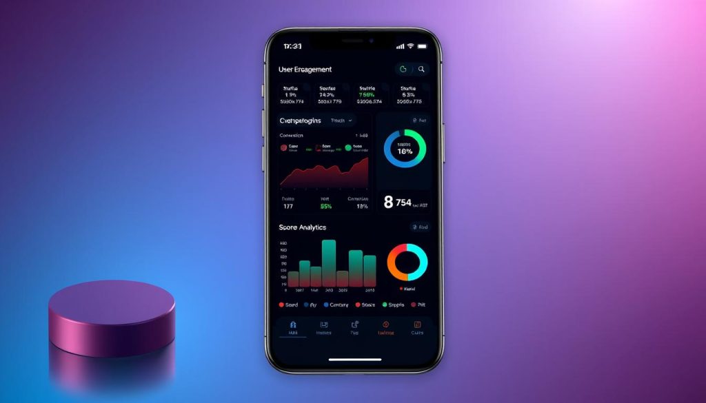
Good mobile analytics offer deep insights into how users interact with apps. For example, tracking Daily Active Users (DAU) and Monthly Active Users (MAU) shows app popularity. Longer sessions often mean users are more engaged, while high drop-off rates suggest usability problems.
Monitoring app performance is also critical. Studies show 47% of users leave if an app doesn’t start quickly. Even a one-second delay can cut conversions by 7%. So, it’s important to watch metrics like Time to First Byte (TTFB) and Page Load Time.
Understanding user behaviour can reveal important trends. Tools like Contentsquare Analytics track active users, session times, and conversion rates. This data helps improve apps and marketing plans.
| Metric | Impact |
|---|---|
| Retention Rate | Shows ongoing user interest |
| Conversion Rate | Apps average 1.6% vs desktop’s 3% |
| App Uninstalls | Shows user happiness |
By using these insights, businesses can make better decisions to boost their mobile presence. This leads to success in the digital world.
Mobile Commerce Optimisation
In the world of mobile commerce, making things better is key. With mobile sales set to hit £710 billion by 2025, it’s vital for businesses to make shopping easy for customers. We’ll look at important areas like making checkout smooth, integrating payments, and keeping data safe.
Checkout Process
A simple checkout is essential to keep shoppers from leaving. Research shows 45% of people give up if it takes too long. Using a one-page checkout can really help, with BigCommerce’s method leading to a 70.8% success rate.
Payment Integration
It’s important to offer many ways to pay. Adding digital wallets and one-click payments makes shopping better. BigCommerce works with over 130 payment options, giving shops lots of choices. Apps are 3-4 times better at converting than mobile sites, showing the need for easy payments.
Security Measures
Keeping payments safe is critical for trust. By 2025, Gartner says 60% of companies will check security before making deals. Using strong encryption and secure payment systems is essential. These steps protect data and build trust in mobile shopping.
By improving these areas, businesses can build trust, make shopping easier, and increase sales in the mobile market.
Future Trends in Mobile Optimisation
Looking ahead, new technologies will change how we use our phones. These changes will transform our digital world.
5G will make mobile browsing faster and smoother. This means we’ll see new ways to make websites work better on phones. Augmented reality will also become more common, bringing new experiences to our screens.
Voice search is becoming key. As virtual assistants get smarter, websites need to be ready for voice commands. This means focusing on how we talk and using AI in web design.
Mobiles will soon offer more personal experiences. Machine learning will help websites understand us better, showing us things we’ll like. This personal touch is important for keeping users interested and helping businesses grow.
“The mobile landscape is evolving at breakneck speed. Staying ahead requires constant innovation and adaptability.”
As a WordPress expert, I’m excited about Progressive Web Apps (PWAs). They make websites work like apps, without needing to download anything. PWAs are set to change how we use mobile websites.
To get ready for these changes, businesses should:
- Invest in 5G-ready infrastructure
- Develop voice search strategies
- Explore AR capabilities for their products or services
- Implement machine learning for personalisation
- Consider PWA development for enhanced user experience
By keeping up with these new technologies, businesses can lead in mobile optimisation. This ensures they meet the changing needs of mobile users.
Conclusion
Reflecting on mobile optimisation, it’s clear it’s now a must, not just a nice-to-have. With almost 96% of the world’s internet users on mobiles, making your website mobile-friendly is key. It’s not just about keeping up; it’s about staying ahead.
We’ve looked at many parts of mobile optimisation, like responsive design and content strategy. The numbers are striking: 60% of all web traffic comes from mobiles. Businesses that focus on mobile users stand out. They attract more visitors and keep them interested, leading to better sales and higher rankings on search engines.
The future of digital success is all about getting better at mobile optimisation. As a WordPress developer and SEO expert, I’m here to help businesses thrive in this mobile-first world. By using the strategies we’ve discussed, you can make your mobile site fast and easy to use. This will not only meet but exceed what users expect, driving your success in a mobile-focused market.


